During our planning stage we the textual analysis of films played a crucial role, it helped in our search for an idea, how we were going to film, our music choice, as well as many other things. The films we spent most of our time looking at were the “Bourne series” based on a novel written by Robert Ludlum, and the James Bond film "Casino Royale". The idea for the film was heavily influenced by the Bourne films, as the story line is quite similar. The good guy is captured by the bad guys, the good guy finds out who the bad guys are, the good guy then kills bad guys - a classic action/thriller film story line. Also, the way in which the story unfolds was very similar, leaving the audience in the dark, with the story line unfolding for the audience at the same time is unfolds for the main character who is trying to find out information about the "baddys".
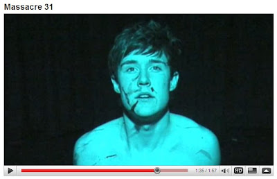
The scene at the begginning with the main character in the cell tied up to the chair was inspired by the Casino Royale film, where James Bond is being tortured while tied up to the chair, unaware where he is, and thinking of ways to get out. The limited amount of colour and the way in which the angles are shot, followed by the limited vision, leaving you focused on the main character are both similar in Massacre 31 and Casino Royale, the similarity between these 2 shots is shown below.
How does your media product represent particular social groups?
The main character in Massacre 31 remains nameless for most of the duration of the film, adding to the mystery behind the plot of the film. This leaves the audience wondering who is, and why he is so special. We tried to create a character who is both physically and mentally strong, but susceptable to other weaknesses. Old before his time, we tried to create a younger James Bond esque character, who would have more trouble facing his foes who would be more mature and physically bigger. This inspires the audience to believe that you don't have to bigger than your opponent to come out on top, with the characer using skill over brute force. The small wooden chair was used in our 2 minute introduction to emphasise this point, that something that comes across as reasonably small and weak, is strong enough to keep someone confined too without breaking or showing any sign of stress. A key feature that would show throughout the film.
The clothing was picked to show the difference between the way he was before he was in the cell, to the way that he was in the cell. Before he was dressed smartly, with a long jacket, a scarf, a nice pair of trousers and a pair of shoes. When you go from this, to the attire that he is wearing where he is bound to the chair, which is a ripped pair of trousers, there is a huge difference, which both symbolises the hardship he's gone through, and the difference a set of clothes can have on someones perspective of somone else.
The main characters difference in hair styles also had this effect. With one looking very neat, the other looking as if he had be "dragged through a bush".
Lastly, the blood covering the main characters body also shows how rough he's had it while he was in the cell, with dried blood as well as fresh blood. This shows that he has been tortured or beaten up, which leaves the audience once again wondering what has happened, and thinking about reasons why it's happened to him, and what he has done or what he knows.

What kind of media institution might distribute your media product and why?
Film 4 Productions would be the perfect distributor for Massacre 31 for many reasons. Firstly, they are a British company, and invest mostly in British films. Also, they are quite well known for taking risks on productions, and as this would be MaxAls first film, that would be very necessary as many other distributors would be unwilling to invest in a film that is not guarenteed to do well.
Who would be the audience for your media product?
The audience would be aimed at adults and older children probably 12+. This is because the film contains violence, loud noises, and a complex plot, which younger children may not understand. This is because throughout the film, as i have mentioned, the audience are left thinking about why things are happening, and are required to fit pieces of the film together. It is particualary appealing to males as there are cars, fight scenes, a girl. However, there are also many thing that will attract the female audience, (the stunning main character is a start). With something for everyone this is a film with a huge variety of audience.
How did you attract/address your audience?
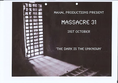
We made a poster for our film which was very eye catching, we put a picture of a prison cell through Photoshop, raised the contrasts to add a chilling effect and put the title of our film in broken up typewriter font. The poster caught peoples eye and interest because it is different to the normal advertisement posters for films, as it doesn't give any of the plot away, and leads people into wondering what the film might be about, therefore encouraging them to watch it. The poster has a very dark look to it, suggesting to could-be audience that it is not for the faint hearted.

What have you learnt about technologies from the process of constructing this product?
Throughout MaxAls production stage, technology was not our friend, with many things going wrong it would be impossible to list them all. However, eventually, we got on top of things and nailed down some top notch filming and editing. Having to film the cell scene 3 times due to camera problems and ambient noise which was unwanted was not a nice feeling, however, the final footage was much better than the first. The great amount of practice we had, really did make a difference. Once we'd finished the filming, we yet again had more technology crisis' with hard drive problems causing our work to be lost, meaning we had to begin editing again. This again, however, did not deter us, and we got down to some hard work and eventually mastered the Apple Mac computers and Final Cut Express. One soon realises the advantages you have with a Mac over Windows, because they are much faster, have much more storage space, and the graphics are noticeabley better. Also, final cut express is an amazing package, with so much variety in what seems like such a small space. We quickly found where the special effects we desired were, how to use them successfully, and this shows throughout our film. Lastly, we also used garage band to great effect, using many different sound effects such as the water dripping, and the eary whine in the background of the introduction. Both of which added great depth to our film, and added more to the suspense, mystery, and thrill.
Looking back at your preliminary task, what do you feel you have learnt in the progression from it to the full product?
I feel that we all learnt a great deal from our preliminary tasks, and that we used the techniques we learnt in our preliminary and used them in our main film. However, we have definitely progressed a lot since our first attempts, we have become more creative with more ideas. Using basic techniques and developing them, we have produced something that we are all very proud of, and would never have thought we'd be able to make something of this standard when we first realised how hard it was when we were doing our preliminary task.
Not only have we learnt practical skills from our preliminary, but it also helped us in preparing everything before a shot, and many other things such as where we should film each shot from, camera angles etc.
Editing also became much easier, when i first attempted editing the film it took me a whole lesson to work out how to get the footage onto the computer, let alone begin editing the footage into something that was watchable. But from those experiences, it has taught me how to use it, and without failing at first, i'd have never learnt vital skills that are essential to be a good editer.


